

"Project 1 | Building Awareness"
An artistic orihon booklet made to encapture my classmate's relationship to water, and what gives them joy in the world.
Our class was poised with a colossal icebreaker at the beginning of the semester by having us interview a classmate with thoroughly psychological questions built around the idea of water, and what makes them feel connected to the world.
My interviewee, Dariella, finds her place in the world through travel, dance, and being in metropolitan areas.
When water related questions were asked, Dariella said that her upbringing in San Jose let her be a stones throw away from water, but made it difficult to have it be an integral part of her life, spiritually at least.
With this in mind, my booklet utilizes data-moshing as a way to combine this fluidity of pixelation, harkening towards the digital nature of Silicon Valley, and a metropolitan skyline that gives her enjoyment.
My backside cover of the book utilizes an abstract sketch of water based upon one of my own photos, incorporating deep blues, and brick red, as a dichotomy between brick and mortar, and water.


"Project 2 |
Discovering the Relationship
Between Design
and the Human Experience"
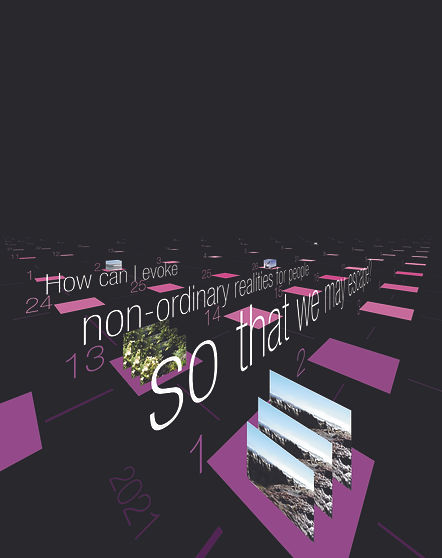
An introspective calendar built from meditative thought and development of a calling intention.
Following our project where we did a deep dive into our partner's life, our second project was a deep dive into our own, drawing upon important events from our pasts to help us gauge how we use design in the future.
Being a fan of escapism, and world-building, I was able to develop the calling intention:
"How can I evoke non-ordinary realities so that we may escape?"
This is a broad proclamation towards the idea that I want my work to exceed in letting others find a moment to leave the trappings of our world and fall into what I can create. Whether that's something simple that catches their attention, or on a much
more grand scale.


"Project 3 |
Leveraging Your Callings Into Organizational Intentions"
A group project manifesting our intentions into a green company with
these values at heart.
Our final formal project involved us combining all of our values that made up our calling intentions, and then manifesting that into a company that can echo those values and do good by the world at large.
"Curio", originally suggested by myself, is a second-hand subscription box service that would send curated vintage garments to your doorstep with an interesting history, interesting silhouette, interesting construction, or better yet, an amalgamation of all three.
The premise of this company is to show people the value in the burgeoning secondhand market that is quickly becoming the norm for many fashion-goers, by presenting it in a palatable, easy way. On top of this, by showing people the true worth of second-hand clothing, we wish to proliferate the idea that people can get great clothing that already exists. By reducing spending habits in the current zeitgeist of fashion, you reduce your footprint by not buying into an industry that is one of the largest contributors to greenhouse gas, and water expenditure.
My responsibility specifically was our brandmark, and its area of isolation.
Our logo combines the iconography of a question mark, and the curiousity that brings, with the hanger, which is easy to
correlate to clothing.


