Student Work
Formatively created at San Jose State, the following work is what I was able to create amongst many of the design related classes that were offered at the school.
Enhancing skills in mixed media, print, digital, and more, San Jose State offered a wide range of aesthetic challenges that I could rise to, and pushed the envelope in many ways to be able to explore my inner machinations, and to make designs that fulfilled prompts given.


"REAL"
Resized to breaking, warped with After Effects, "REAL" focuses around the consistent talking point about how real the people we post on the front of magazines actually are.
While we reside in an aesthetic renaissance where many disenfranchised individuals are being championed for the beauty that they have, beauty is still something in the eye of the beholder. The idea of beauty is morphed and coalesced by influences of all kinds, so the original idea of "REAL" is distorted as well, nebulous in nature as it isn't defined by
one specific thing.
This piece attempts to tackle that ideology.


"RAM"
RAM (Random Access Memory) is the hardware in a computing device where the
operating system (OS), application programs, and data in current use, are kept
so they can be quickly reached by the device's processor.
How we call upon this information in our own head works similarly. “Flashbulb memories”
refer to very specific moments that we remember for very specific reasons.
At the same time, how we remember this information distorts with the
passage of time. Certain ephemeral moments blur, ebb, crop, and warps even though it feels like imagery that should be right at the forefront of our mind.
This piece aims to capture the dichotomy and similarity between computers,
and how we compute.


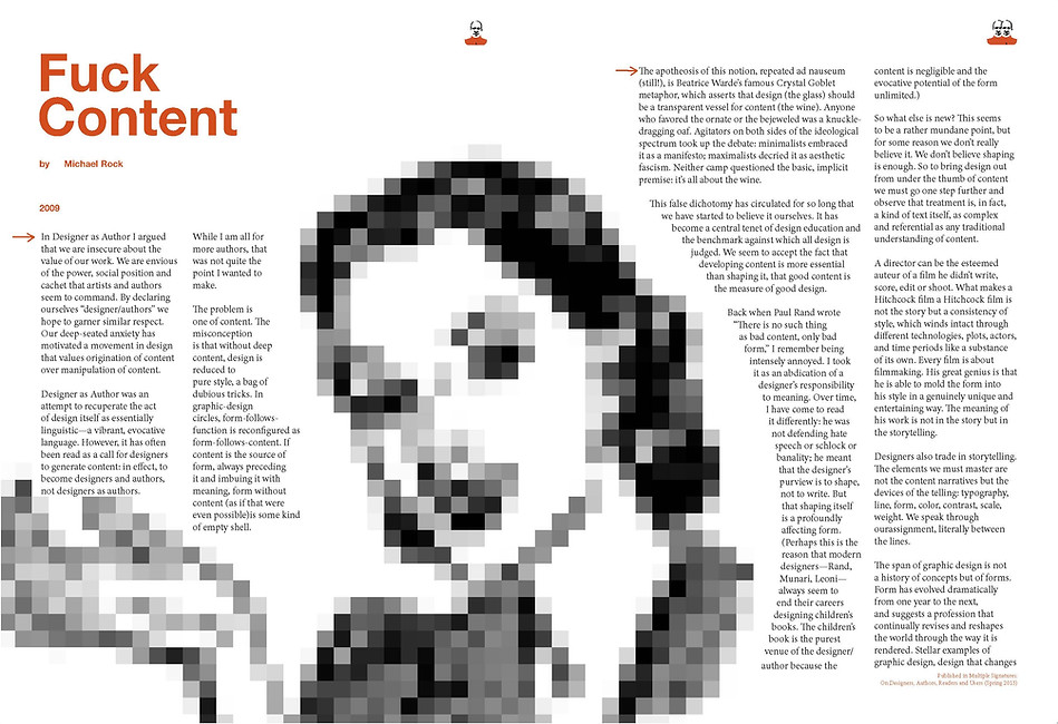
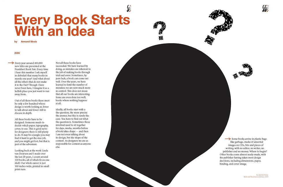
"Welcome to the Book"
Formatting of essays written by famous designers of our time.
The culmination of our typography class, "Welcome to the Book" is a collage of all of the typography skills I developed throughout the semester.
Learning and failing with die cuts.
Screwing up gutters.
(making graphics large and black in the center as to create an understandable graphic that sits in the middle of a spread.)
Making fun page numbers.
(thinking to myself, hey, page numbers are lame, lets make traces of the author and just duplicate it to indicate page number for that essay.)
This project was a great foray into the world of book design


"Neuropol"
A formatting and identity creation for
Ray Larabie's typeface "Neuropol".
Typography is overlooked as implicit mood.
Being self indulgent, I went into the project using this early 2000's hyper digital typeface because of my music taste at the time.
Drawing on inspiration from videogames like "Dance Dance Revolution" and "SSX Tricky", I set out to develop a typeface identity that embodied a nostalgic view of "future", paradoxical really.
While formatting the type in a paragraph setting was far from easy, learning how to sculpt an interesting hierarchy for the information was explorative and exhilarating.
Topping it off with an animation. I was super excited to send this off to Ray himself and see what he thought...
And he approved!

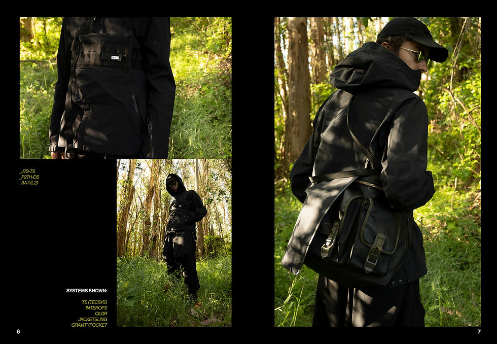
"Sisyphus"
A photo editorial project centric around the brand Acronym, set against nature.
Sisyphus was taking one of my favorite clothing brands, and creating a love letter to it through a photo project.
Most of their clothing is exhibited in a very muted studio, or the occasional urban environment when it comes to their editorials.
Given my proximity to the woods, I felt like this would be a great opportunity to make compelling work somewhere outside of my house, given the current global situation.
This project was one of the first where I had a very clear, distinct vision going into it, that only needed to be executed.
I'm glad I was able to.


